|
|
Post by CowboyGuy on Feb 16, 2007 5:28:40 GMT -5
Hey guys! I'm pleased to have up a new layout! Please give me feedback on it. I want to know what everyone thinks. We can't have wacky colors because it is too hard to read. I was inspired by a few new things coming up and I wanted to have a more modern professional look. What do you think? Kinda challenging but I learned much! It's still a work in progress BTW. Anyway...  -CowboyGuy |
|
|
|
Post by Lior Knight on Feb 16, 2007 5:37:46 GMT -5
I like the colors, and it's very refreshing but the forum looks so narrow on my screen..could you make it wider? Not necessary as wide as the last design but not as narrow as this one.
|
|
|
|
Post by buffyfannumerouno on Feb 16, 2007 5:47:12 GMT -5
I love the new look. It did need a change and this looks so much better. I agree with Lior Knight that it is refreshing but does need to be a little wider than it is now.
|
|
|
|
Post by arron on Feb 16, 2007 5:47:14 GMT -5
Its definately a refreshing new look. I think it will take some time to get used to but it looks great to me. I agree it does need to be wider though.  One thing I do notice is that sometimes the photos that used to ALWAYS be there are now showing up with red crosses. Like the banners and btvsfigs signs etc... |
|
|
|
Post by willowswarlok on Feb 16, 2007 5:48:54 GMT -5
ok, i love the new style
but i agree that it looks a bit narrow
also, i dont like that the number of pm's isnt shown on the top of the screen
could these be fixed?
wayne
|
|
|
|
Post by The Second Evil on Feb 16, 2007 5:49:16 GMT -5
Wow! Loving the new look, it's about damn time for a change! Maybe the colors should be tweeked a little too?
But Yes, the page width should be sorted though as I find it's a little too narrow for my liking.
|
|
slayerverse98
Potential Slayer
 She's beautiful with a lion's heart and the face of an Angel
Posts: 447
|
Post by slayerverse98 on Feb 16, 2007 6:29:27 GMT -5
I like it. Nice new look but i have the problem everyone else has - it's too narrow on my screen
|
|
|
|
Post by Lior Knight on Feb 16, 2007 6:36:20 GMT -5
ok, i love the new style but i agree that it looks a bit narrow also, i dont like that the number of pm's isnt shown on the top of the screen could these be fixed? wayne Right, the PMs number, haven't noticed that till now. Also, the clock was kind of handy. |
|
|
|
Post by CowboyGuy on Feb 16, 2007 6:48:02 GMT -5
When you have a new PM it will blink saying "New PM!"
We don't need to have the clock showing. Everyone has a clock on their computer.
I will see what I can do about the narrowness. It's not that bad on my screen.
I am really tired, it's still early morning in California...I will address more issues tomorrow. I have more headers to add as well as icons and Buffy "B" styled icons for the main page.
|
|
|
|
Post by Lior Knight on Feb 16, 2007 7:04:54 GMT -5
When you have a new PM it will blink saying "New PM!" We don't need to have the clock showing. Everyone has a clock on their computer. I will see what I can do about the narrowness. It's not that bad on my screen. I am really tired, it's still early morning in California...I will address more issues tomorrow. I have more headers to add as well as icons and Buffy "B" styled icons for the main page. Well, I was using the clock with a different time zone for the Survivor game but I guess since the game is pretty dead then its not necessary now. What resolution do you use on your PC? Mine is 1280x1024, so perhaps that's why the forum looks so narrow.  |
|
|
|
Post by arron on Feb 16, 2007 7:16:58 GMT -5
Okay. I liked the clock too - it was handy to know what the time was in USA cause I'm in England...
It it still too narrow.
|
|
|
|
Post by a dusty pile x on Feb 16, 2007 7:34:28 GMT -5
I like the narrowness. It makes the forum sleek.
Awesome job CowboyGuy!!
|
|
|
|
Post by wkdwillow on Feb 16, 2007 7:57:32 GMT -5
I love it! Love the colours and that banner is just sweet! Good job well done!  |
|
vampfaz
Potential Slayer
Scream.My.Name
Posts: 366
|
Post by vampfaz on Feb 16, 2007 8:05:05 GMT -5
great theme and colours, but its sooo narrow... my screen res is 1280x1024, and it is really narrow, i think it would look better with a width of 75%, instead of this which im assuming is 50%
|
|
|
|
Post by Jedi Doug on Feb 16, 2007 9:42:42 GMT -5
The new colour scheme seems so bland, washed out and lifeless. I agree it's time to modernize the look, but this palate doesn't make me want to return.
I'm not crazy about the new width either.
|
|
|
|
Post by madvicks on Feb 16, 2007 9:50:49 GMT -5
I agree it was time for a forum overhaul. The grey is very bland and not as jolly and joyful as the other format, in fact I am getting depressed. Too much wasted space on the screen as the forum board is far too narrow. I have a 19" monitor set to 1280X1024 and there is just a huge amount of wasted space either side. Missing the clock again another international member who found it handy knowing what time is it Stateside. No overly enamored with the flashing PM, preferred a static count of what messages I had. Do love the new banner though. Sorry CowboyGuy, I can appreciate that you have put in a lot of work... |
|
|
|
Post by Afer on Feb 16, 2007 10:23:15 GMT -5
Woohoo. Talks of a new layout has been going on for months! CowboyGuy, thanks for giving us a new look!
My screen is 800x600..and i have a big monitor so the forum is perfect for me (apart from the scroll bar to scroll along the way is there)
The colours are a little dull (obviously because it is grey!) but you said a colour change wouldn't work out, so it is cool.
You were saying it flashes when you receive a new PM, will it display "2 New PM" if you obviously receive 2?
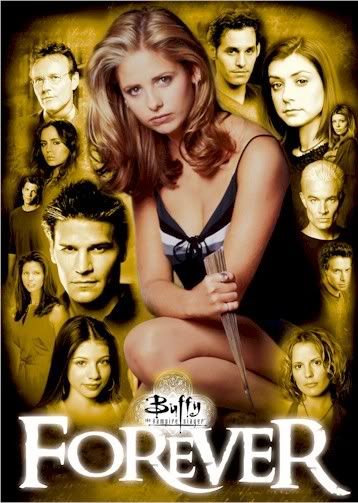
I like the new banner, but it isn't really BtvsFigs connected? I know it is Buffy season 8 comics, but i think a promo image or a traditional Buffy symbol inserted into the main forum banner would be an overall better effect.
It looks like alot of time and effort has went in to this and those are only some suggestions, thanks again ;D
|
|
|
|
Post by Sammie on Feb 16, 2007 10:28:32 GMT -5
I love it! I think it's a very good design. If you can make it less narrow and have a clock up, it would be perfect.
|
|
|
|
Post by Ouija on Feb 16, 2007 10:43:34 GMT -5
I have to agree with others, first thing I noticed was the width. I preffered the width before. The missing PM numbers at the top is a little annoying too. But other than that, I really cannot pick fault! |
|
|
|
Post by Becky on Feb 16, 2007 11:02:24 GMT -5
I think the new layout is gorgeous! Love the teals and pinks. The only thing I can see that might need to be fixed, is all of the page numbers within a thread are the same color. I liked it when the new pages were a different color, that way I could tell where I had left off.
|
|