|
|
Post by Digital Leonardo on Jul 17, 2005 1:03:52 GMT -5
Okay... This may be in the wrong section, but it is art related, so I'll just stick it here.
Rate the Signature Above You, is pretty simple. Rate the signature above you out of a 10 scale. Give the reasons you like it or don't like it.
If two people end up posting at the same time, the bottom person has to edit their post. It's not nice to skip people.
If this is in the wrong section... again, sorry.
Okay, let us get this started.
|
|
|
|
Post by punkrawkerspike on Jul 17, 2005 1:07:21 GMT -5
I give it a 7.5...the images are nicely blended but a bit blurry (which may be the intention, I don't know) and the over abundance of red just kinda adds to the effect of everything blurring together. It's also a bit simplistic, I think.
Things I do like though are like I said, the way the images go together and the fact that it's not just some 'crop, cut and paste random images to shove together' banners.
Now whoever does mine, don't look at me, I didn't make it!
|
|
|
|
Post by slayergal on Jul 17, 2005 1:15:16 GMT -5
For Matt's.... I give it a... 9/10. I like the images used *David!* and it's also blended together very well! =D
|
|
|
|
Post by The Second Evil on Jul 17, 2005 3:34:08 GMT -5
For Taloom's, I give it a 9.5. I really like the fairy-style images you used, they all blend together really well and it makes a very beautiful signature. I really like the colors.
|
|
|
|
Post by immortalvamp on Jul 17, 2005 5:24:43 GMT -5
For the second evils im giving a 7. the choice of pictures really work well together. The font is a nice selection to and easy to read. The only problem id say is its too dark but thats not your fault, Great banner!  |
|
|
|
Post by Ouija on Jul 17, 2005 5:49:33 GMT -5
For Naki I’m giving the banner a 9.5. The pictures look quite cool and they work really well together. The font is just awesome and so is the orange/red highlight. It's also a nice size and isn't too big. The only thing that stops it from being a 10 is the join between the two middle pictures, it looks sort of hazy and like it’s being smudged, and I don’t really think it suits the banner. But other than that its great!  |
|
|
|
Post by VampSpike on Jul 17, 2005 5:53:48 GMT -5
Hmmm id give a 8.5 for OujiRick. The colours go togeather really well, and the bordering design looks really effective. Im not too keen on the pictures of the dolls, they look sorta wierd, and disconnected. If they were infact Dru's dolls taken from the episodes, maybe this coulda been an 9/10. The pictures of the Figures fit perfectly and blend together well. Great Banner! |
|
|
|
Post by punkrawkerspike on Jul 17, 2005 9:54:33 GMT -5
I give VampSpike's banner a 9.5! I love the concept of it and the effects used. Buffy's internal pain really does show powerfully through the banner, and nobody could possibly miss the concept of what you're conveying.
The only reason it's not a 10 is because I figure nothing's ever 'perfect'.
|
|
|
|
Post by AngelAficionado on Jul 17, 2005 11:07:10 GMT -5
I give Matt's an 8/10! I like the pictures used, but not all of them blend perfectly together, but I can forgive this because the subject material is, quite frankly, a ragin' hottie. Also, I think the text is nice, but it could be a little more interesting
I like this banner, but I prefer some of the others you've had
|
|
|
|
Post by willowswarlok on Jul 17, 2005 11:25:51 GMT -5
i love AngelAficionado banner, i give it 9/10
its so well put together and i suppose for certain ppl who think the concept of riley and spike mus be totally hot, it isnt doing anything more me but it is still very well made
great work
-wayne
|
|
|
|
Post by Little Willow on Jul 17, 2005 12:17:25 GMT -5
i give WillowsWarlock a 7.4 i like the banner but it could do with some color....
|
|
|
|
Post by Justhad on Jul 17, 2005 18:08:25 GMT -5
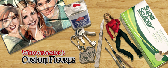
I give Ashleigh a 8.5 because the graphics are great, the font is adorable and the Willow pic is deifnetly cute. I would have loved either some more pics or a pic of your customs to add to it!
|
|
Devon
Scooby Member

Posts: 113
|
Post by Devon on Jul 17, 2005 18:46:48 GMT -5
If nothing can be absolutely perfect then Justhad's is a 9.999 because it's a fantastic picture of Sarah done simply and clearly and with a nice font (in one of my personal favorite colors).
One of the prettier signatures I've seen, so feminine.
|
|
|
|
Post by I Am Me on Jul 17, 2005 20:01:59 GMT -5
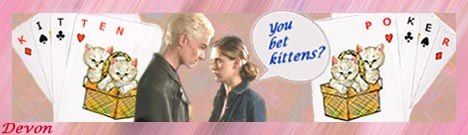
I like the humor of it, though the color choices wouldn't have been my first. The little Kittne Poker cards are cute, love those, along with the dialogue, I give it an 8. ^.^
|
|
|
|
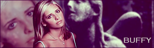
Post by Digital Leonardo on Jul 17, 2005 20:02:32 GMT -5
10 - I love Alexis Bledel and I love Sin City. The black and white is perfect.
|
|
Sanity Fair
Potential Slayer
"Whatever. I'm not looking to hug and cry and learn and grow."
Posts: 338
|
Post by Sanity Fair on Jul 17, 2005 21:00:19 GMT -5
I give Digital Leonardo's signiture an 8.5. I really like all the red but it sort of seems a little too red (if that makes sense) and makes it a little difficult to make out some of the pictures in the background.
|
|
|
|
Post by SlayerLV on Jul 18, 2005 0:42:56 GMT -5
^^ I'll give this one a 8. I love faith and the pictures you chose look wonderful.
|
|
|
|
Post by Lior Knight on Jul 18, 2005 6:51:16 GMT -5
I give SlayerLV’s signature 8/10. I like how each image blends together, and the subject is very beautiful...if only it wasn’t that blurry it would’ve been an easy 9.5-10.
|
|
|
|
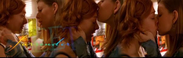
Post by mothperson on Jul 18, 2005 7:47:33 GMT -5
I love goddess rosenberg - the colors and the blurring are part of why! Also the font/title, although I might prefer it less starkly white.
9 on technical (not that I know anything)
9 on artistic
(Hey, they do it in figure skating that way)
|
|
|
|
Post by mothperson on Jul 18, 2005 7:48:43 GMT -5
oops. I was in the wrong place. Wait a minute. Sorry sorry sorry.
|
|