|
|
Post by AngelAficionado on Jul 19, 2005 19:35:16 GMT -5
Awww Hadley, thankyou so much, and I'd like to return the compliment by giving your banner a 10/10 too, in my opinion SMG has never looked cuter than on your banner, and the simplicity of the text placed on the photo, lets you concentrate on the little cutie. With that all tied under a gorgeous colour scheme, it really makes a gorgeous image!
|
|
|
|
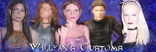
Post by Willfan on Jul 19, 2005 19:50:52 GMT -5
That's such a beatiful banner! I love the mix of pictures, the placements and effects are perfect...I wish I could do stuff like that. Great choices overall, but no matching banner! Boo!  9.5/10 |
|
|
|
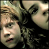
Post by punkrawkerspike on Jul 19, 2005 20:05:01 GMT -5
Willfan gets a solid 9 on that one. It's a nice W/T banner with a cool picture and a very cool picture from a cool scene right smack dab in the middle. Nothing really seems awkwardly out of place and it's all blended together nicely. Nice jon!
|
|
|
|
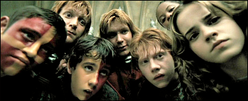
Post by Willfan on Jul 19, 2005 20:12:09 GMT -5
Thanks! I didn't make it...I think buffyssolace did, but I'm not sure and I feel horrible, because I really do love it. I made the icon though hehe. More like cropped lol.
Woops! Almost forgot to judge!
Sorry...wish I were a bigger fan of the teen duo, but unfortunately I'm not. But I think they fit well together, and the pictures in the banner are a good selection. The icon is cooler though! I give an 8.
|
|
|
|
Post by BuffyFanOne on Jul 20, 2005 1:59:56 GMT -5
I give willfan's banner an 8! I really like the pictures of Wollow and Tara on either side. I think that when a screen cap is used there is potential for it to not look great but this banner pulls it off! Nice work!
|
|
|
|
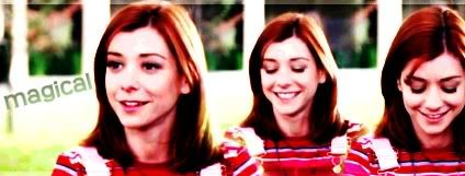
Post by Sammie on Jul 20, 2005 5:38:45 GMT -5
Even though i'm not a Gwen fan i love this banner, i like how some parts are sorta black/white but small parts are coloured (lips/hair), it gives the banner a classic look
The pictures look very good, not blurry at all, and i like how you can see her (faded) face in the middle, a 9 i'd say
|
|
|
|
Post by AngelAficionado on Jul 20, 2005 11:24:20 GMT -5
I love Sammie's banner because it's simple and cute, and the pictures are cleanly blended together without having to use any textures or filters. The text is also adorable, and sort of sums up both Dawn and Tara's personalities. The pictures themselves are adorable, but a tiny bit blurry (which is probably just because of JPEG and cuz a couple had to be enlarged.
Overall I give it an 8, just cuz of the blurry thing, and cuz it'd look even better if it had a unifying colour theme, but other than that, it's such a cute banner!
|
|
|
|
Post by I Am Me on Jul 20, 2005 13:24:31 GMT -5
Wow, that really is quite a lovely banner! The blending is really exceptional, and the miniature scenes in the lower left are really a nice touch. However, I'm not a big fan of the focus picture for Cordelia, I would have liked to see another picture of Charisma.
Despite that, I give it a 9.5 as it is undeniably one of the classiest banners on the entire board. Lovely work!
|
|
|
|
Post by Afer on Jul 20, 2005 14:24:01 GMT -5
Never seen SIn City but i think the banner looks great. the black and white is good contrast and the the quote plus the little comic strip box thing...all very nice!
9.3
|
|
|
|
Post by SlayerLV on Jul 20, 2005 15:10:30 GMT -5
I give Afer's a 8.5 the blending is great and I love the blood droplets. The only thing that gets me is the saying on it.
|
|
|
|
Post by Justhad on Jul 20, 2005 15:24:29 GMT -5
Lacey- I give your banner a 9.5 because I love the pictures of Alyson - she's very stunning even when she's not Willowesque. There's a tad bit of blur but other than that I love it!
|
|
|
|
Post by punkrawkerspike on Jul 20, 2005 15:40:49 GMT -5
Hadley's banner gets an 8 from me, just because of how simple and pretty it is. It REALLY suits you!! I also love the way it's sort of faded like an old photograph...it makes it feel sort of vintage and worn.
|
|
|
|
Post by Thorn Of Deucalion on Jul 20, 2005 16:49:37 GMT -5
I give Champion of Hotness an 8/10 , i think the pics blend in together , the The icon is a 9
|
|
|
|
Post by BuffyFanOne on Jul 20, 2005 17:08:40 GMT -5
I love Gachnars banner! That is a classic Buffy episode and you have done it justice! The images work very well together and the pictures are a good quality! W/out the saying I give it a 8 but with the words I give it a 9, They really dress it up! Nice work!
|
|
|
|
Post by Insanity on Jul 20, 2005 17:22:47 GMT -5
buffyfanone, I like your banner. It is really cool. I love how it is just one color with different shades. I does really well representing the Buffy/Angel relationship! Overall an 8.5/10!(just a little blurry on one of the pics ) |
|
|
|
Post by punkrawkerspike on Jul 20, 2005 19:04:07 GMT -5
Insanity, your banner gets a 9. You chose some perfect shots of Buffy from the episode, and anyone would be able to look at it and understand the pain, confusion and anguish she was suffering at the time. Great job!
|
|
|
|
Post by Demonslayer212 on Jul 20, 2005 19:09:16 GMT -5
Willfan, I'm the one who made your banner...and I am offended...I did even have to revise it once or twice. No no, just kidding, it was a long time ago and I do like the banner.
I give Champions banner a 8.5. The blending could probably be a little better in some spots, but good otherwise.
|
|
|
|
Post by Digital Leonardo on Jul 20, 2005 19:13:45 GMT -5
Demonslayer212, 9 - I really like the banner. It is a great recap of the season finale and it is so strong. The font is a little off... which lost the 1 point.
|
|
|
|
Post by Immortal on Jul 20, 2005 19:24:40 GMT -5
Digital Leonardo, I give your banner an 8. I really like the choice of caps for the banner. 'Chosen' was a very important episode for Willow. The banner is on the blurry side though and is kind of small.
|
|
|
|
Post by BuffyFanOne on Jul 21, 2005 1:17:50 GMT -5
Immortal, I love your banner! It really does justice to the most important Buffy episode ever! I would have liked to see faith instead of a potential though. If it weren't for that I would give it a 9. I give it an 8  Really nice work! |
|


 Really nice work!