|
|
Post by Afer on May 19, 2006 16:23:29 GMT -5
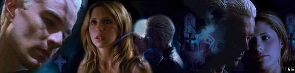
 I was bored on Friday night and was playing with season 6 and 7 caps making banners and came across this beautiful background and thought i would pull together a little wallpaper. I wouldn't be too worried if people spotted bad blending but i couldn't spot any major ones. I tried to stretch out throughout the season, showing caps of each character going through different emotions. I looked through loads of quotes but i felt "Season 6" would be enough  Please feel free to use it. I left a space up at the top (above the cast photo) for your main window icons  Please tell me what you all think.  |
|
|
|
Post by Digital Leonardo on May 22, 2006 15:16:20 GMT -5
I think you may have TOO much going on in this. Just because its a season wallpaper, dosn't mean everything has to be jammed into it. The placing is all good, having the group shot then the many shots of the episodes. A simple color over them all would be nice, to give it all the same flow.
But nice work all together, just got to work on organization.
|
|
|
|
Post by Afer on Jun 24, 2006 5:20:09 GMT -5
I think you may have TOO much going on in this. Just because its a season wallpaper, dosn't mean everything has to be jammed into it. The placing is all good, having the group shot then the many shots of the episodes. A simple color over them all would be nice, to give it all the same flow. But nice work all together, just got to work on organization. Thanks for the advice Trav  ..I might try another season wallpaper using your tips |
|
|
|
Post by slayer489 on Jun 24, 2006 5:30:06 GMT -5
I think that it looks good. You really captured everything you could of the sixth season. |
|
|
|
Post by AngelAficionado on Jun 24, 2006 16:42:38 GMT -5
Shockingly bad.
|
|
|
|
Post by stakey on Jun 25, 2006 8:58:25 GMT -5
What!!!!! I love it! Iv had it as my computer wallpaper for a while now. It has now changed to tomb raider but I really like this wallpaper. I dont think there is too much going on. Maybe you could cut down on the images in your next one, but it sums up season 6 well. AA I think you should stop trying to pick a fight. If you think it is 'shocklingy bad' then keep it to yourself. If you dont like it give constructive criticism not an outright insult. I know if something like that was said about a custom I made I would be really offended. |
|
|
|
Post by Afer on Jun 25, 2006 10:43:59 GMT -5
Get A Grip! As James said, if you don't have any "constructive criticism" then why even bother posting  Lmao Its fine. I don't take offence to it, i just laugh Thanks for all the comments everyone else |
|
|
|
Post by ba|1 on Jun 25, 2006 10:51:23 GMT -5
Really good, but I have a suggestion! I wouldnt do too much blendings. Its a nice graphic, but useless as wallpaper. There are too much pictures, its really difficult to find the orders at the desktop-.- so a little less is a little bit more sometimes |
|
|
|
Post by AngelAficionado on Jun 25, 2006 12:47:26 GMT -5
AA I think you should stop trying to pick a fight. If you think it is 'shocklingy bad' then keep it to yourself. If you dont like it give constructive criticism not an outright insult. This is a discussion board, I'm perfectly within my rights to offer a dissenting opinion. But fine, if I have to prove I'm not just picking a fight, and that I genuinely have reasons for saying this piece of "art" is bad, then here they are: -Awful blending, there are way too many boxy edges showing, and not in a cool grunge-style way. It just looks rushed and slapped together. -Too many images. If you're going to put 22 images and a promo shot in one wallpaper, you have to think of a more appealing and clever way than just showving them all in on the edges. -Too many non-matching pictures. All the pictrures are way too different in colour and contrast, so it just looks murky and messing. You have to make sure your pictures fit together to give a feeling of coherency. -A texture that doesn't fit with the colour scheme (if such a thing exists in this piece). -No sense of organization or meaning. So there. That's why I think this is shockingly bad, and until Afer learns to utilize his graphics program properly, and pay attention to colour and organisation as well as more technical stuff, then anything that follows will probably be just as bad. You love this piece? Fine, I have different tastes |
|
|
|
Post by Kenobi on Jun 25, 2006 19:58:09 GMT -5
AA I think you should stop trying to pick a fight. If you think it is 'shocklingy bad' then keep it to yourself. If you dont like it give constructive criticism not an outright insult. -Too many images. If you're going to put 22 images and a promo shot in one wallpaper, you have to think of a more appealing and clever way than just showving them all in on the edges. There are actually 21 images and a promo shoot, but whatever. I really like the wallpaper. I, myself, am using it and have been using it since it was posted. |
|
|
|
Post by AngelAficionado on Jun 25, 2006 22:11:12 GMT -5
Congratulations, you love his wallpaper and you can count.
Two things I couldn't care less about!
|
|
|
|
Post by willowtara on Aug 12, 2006 5:58:30 GMT -5
Okay.. WHAT did I walk in on here? *SOMEBODYS* Cranky Afer I can't see your banner but I'm sure it's great! Maybe fix the picture so I can see - AA, I don't mean to get 'involved' but is something up? That kind of comment is sort of, well, I think, a bit much personally Don't want to be treading on any toes here, but come on. Calling somebodys work, which they have taken the time to do, like it themselves, and others too, and then for somebody to tell them it's shockingly bad - I think you went too far. I'm sure if somebody said something that you did was shockingly bad, you would have a problem with it, so maybe you should be a bit.. nicer  |
|
|
|
Post by Afer on Aug 12, 2006 6:25:14 GMT -5
I have actualy deleted the wallpaper now due to low disk space! To be honest, just ignore him All My Other Wallpapers Have There Own Thread. |
|
|
|
Post by willowtara on Aug 12, 2006 7:12:31 GMT -5
LOL Afer - But people like that annoy me. Grr... No need to be so negative and rude. I just think it's uncalled for. I hate nastyness (sp?) |
|
|
|
Post by The Second Evil on Aug 12, 2006 9:48:08 GMT -5
Wow... this thread is so old. Why pick at other member's old scabs? Strange. And there's not even the wallpaper left to comment on... I don't like nastiness either but I hate random bumping even more |
|
|
|
Post by willowtara on Aug 12, 2006 14:13:39 GMT -5
Well, its about 7 weeks old. Erm, is that SO old? I have been PMing Afer and he seems a great guy, so I decided to take a look at his wallpaper - that's when I saw AAs nasty comment. So, I decided to comment!
|
|


 ..I might try another season wallpaper using your tips


 Lmao
Lmao