|
|
Post by ba|1 on Apr 12, 2007 4:42:42 GMT -5
Insanity your banner is hot!
|
|
|
|
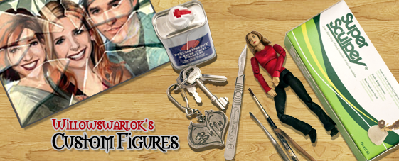
Post by willowswarlok on Apr 12, 2007 6:26:10 GMT -5
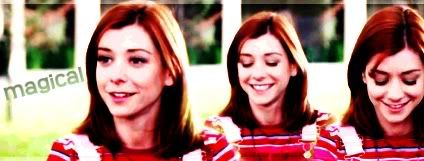
Ok, I told myself I was going to try only because I didn't think i had the time...but I caved and did one anyway   I wen't with a green and gold just to be different, and I used all the Chosen Figs(Well, the spike fig wasn't really but his character was a big part of it  ) P.S. Lior Knight, I really hope you don't mind me using the moon in my banner. I just thought it was missing something and a moon seemed to be a great idea, its just you were already using them... definately my favourite of all banners so far. it just screams buffy way to go Wayne |
|
|
|
Post by Lior Knight on Apr 12, 2007 7:45:03 GMT -5
Andrew, awesome banner! Very colorful and eye-catching. Though, I think you should add Dawn as well. Here is the "fixed" version of my previous layout:  1 + 2 feature different fonts while 3 & 4 are variations of #2. |
|
|
|
Post by Jedi Doug on Apr 12, 2007 11:32:56 GMT -5
I really like Insanity's banner but the tag line at the bottom is a bit hard to read with my old eyes. |
|
|
|
Post by BtVSFigs Admin on Apr 12, 2007 13:19:31 GMT -5
Insanity, I'm definitely loving yours! If you could add just a slight border to it (I'm talking like a barely there little thing so it kind of looks embossed) it would be perfect and the figures being cut off would be okay.
I also think if you could increase the bottom font a little bit or maybe make it a tad bigger it would be just grand!
LK, those are all really nice variations! I'm really torn between yours and Insanity's!
|
|
|
|
Post by Insanity on Apr 12, 2007 14:50:46 GMT -5
Flobbo, I'm not sure if this is what you meant by embossed (since embossing means something like this in my graphic design experiences), but I added a one pixel black border, so let me know what you think! I increased the shadow on the bottom text and also upped the font. I think it should be easier to read now  I also made a version with Dawn, but I'm not sure it looked as well as the other, oh, and I made it a tad bit darker. Without Dawn: 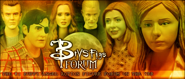  With Dawn: 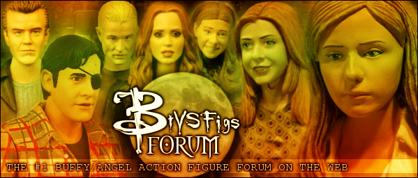 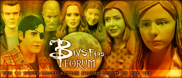 I also did some fooling around with the shadowing on the "BtVSFigs Forum" part, so do you guys think the darker shadow looks better? Or shall I keep the lighter version? |
|
|
|
Post by Jedi Doug on Apr 12, 2007 15:34:11 GMT -5
I like version 3 there with Dawn and the darker shadow on the logo. Embossing can be done with Photoshop under the Layer Style menu Plain  Embossed  |
|
|
|
Post by Insanity on Apr 12, 2007 16:48:47 GMT -5
Oh, ok, I get ya. It might take me a while though. .I have GIMP so I need to figure out how to do it first |
|
|
|
Post by Thorn Of Deucalion on Apr 12, 2007 17:10:30 GMT -5
wow Insanity , that is really great ! it would be cool it you could make an Angel banner on the Angel figures section and use Lior Knight's on the Buffy section or the one that doesn't get used so then we can still see it every day.... |
|
|
|
Post by Jedi Doug on Apr 12, 2007 18:22:24 GMT -5
Oh, ok, I get ya. It might take me a while though. .I have GIMP so I need to figure out how to do it first If you PM me the file without the border, I can do the embossing on it and PM it back to you as a JPEG. |
|
|
|
Post by KAL-EL on Apr 12, 2007 18:24:49 GMT -5
Andrew you totally rocked that banner...just looking at it gives the forum a fresh new vibrant look!!! Lior your new altered banners art hot!!! I agree with Tim these two banners are the top picks!!! Great Job guys!!!  |
|
|
|
Post by Insanity on Apr 12, 2007 18:36:49 GMT -5
thanks Kal-El ;D Oh, ok, I get ya. It might take me a while though. .I have GIMP so I need to figure out how to do it first If you PM me the file without the border, I can do the embossing on it and PM it back to you as a JPEG. I foudn the feature and tried it but it didn't come out right... 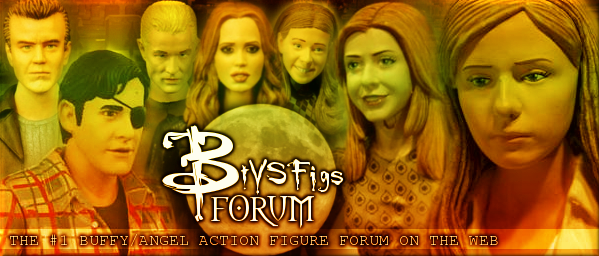 So I'm PMing you JediDoug! ( non-bordered version, In case you read this first) |
|
|
|
Post by Insanity on Apr 12, 2007 19:48:28 GMT -5
Ok, heres the embossed one (big thanks to Jedi Doug!)  |
|
|
|
Post by SlayerLV on Apr 13, 2007 1:05:33 GMT -5
OK I really like the first version of Insanity's banner on this page without Dawn, it just looks to cramped with her in there. Or even if you switched Dawn and Spike around it might not look as cramped. But hey this is just my opinion.
|
|
|
|
Post by Insanity on Apr 13, 2007 1:48:52 GMT -5
Hey, everyone's opinion matters here! So here is what it looks like with dawn and spike switched. better? 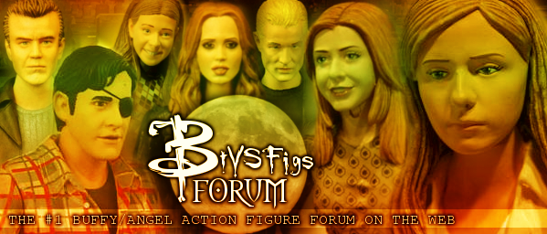 |
|
|
|
Post by SlayerLV on Apr 13, 2007 1:54:24 GMT -5
I like it alot better with them switched it looks less crowded
|
|
|
|
Post by KAL-EL on Apr 14, 2007 18:54:32 GMT -5
Wow!! That looks so cool Insanity   |
|
Buffysmglover
Scooby Member
 Guess What I'm Co-ordinating Now.
Posts: 129
|
Post by Buffysmglover on Jun 24, 2007 3:59:07 GMT -5
For some reason, Dawn's face scares me on that figure. Nothing about the banner, just the figure. That's a pretty big smile.
|
|


 )
)


 I also made a version with Dawn, but I'm not sure it looked as well as the other, oh, and I made it a tad bit darker.