|
|
Post by esc on Mar 24, 2007 18:49:28 GMT -5
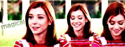
: Good Vs Evil Doppelgangland Doppelgangland ;D Loves it! ;D |
|
|
|
Post by Thorn Of Deucalion on Mar 24, 2007 18:57:34 GMT -5
i really like the Doppelgangland one ...you should try and make a Buffy v.s angel one with Angel , Cordy and Wes on the other side....
|
|
|
|
Post by Lior Knight on Mar 24, 2007 19:21:23 GMT -5
Like this?  |
|
|
|
Post by Thorn Of Deucalion on Mar 24, 2007 19:53:36 GMT -5
wow ! that looks sooooooooo good ... i love that banner , i hope it gets used ! 10/10 lol ;D
|
|
|
|
Post by Jedi Doug on Mar 24, 2007 20:00:57 GMT -5
I like the new Buffy and Angel banner, Lior, but I'm wondering if you can make Wes a bit more prominent and tone down the red in Cordy's top a bit?
|
|
|
|
Post by Lior Knight on Mar 24, 2007 20:10:15 GMT -5
I like the new Buffy and Angel banner, Lior, but I'm wondering if you can make Wes a bit more prominent and tone down the red in Cordy's top a bit? Thanks! And sure thing.   |
|
|
|
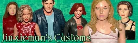
Post by Jinxieman on Mar 24, 2007 20:56:31 GMT -5
Wow! Those are all fantastic Lior. I don't think I could choose which one I like better. I really like the one that has both Buffy and Angel characters, but I also love the good vs. evil and the dopplegangland ones. Great Job!
|
|
|
|
Post by CowboyGuy on Apr 2, 2007 21:27:41 GMT -5
While I think these are nice, to me they look too busy. I'd shrink the pics of the figures and mute the colors a bit more so they blend in with they sky. It will look more professional that way, in my humble opinion  |
|
|
|
Post by Lior Knight on Apr 7, 2007 18:16:02 GMT -5
Thanks for the tips, Phil. Anyhow, I made a couple more:   |
|
|
|
Post by wkdwillow on Apr 7, 2007 18:29:21 GMT -5
<3 them both |
|
|
|
Post by SlayerLV on Apr 8, 2007 1:09:23 GMT -5
I like this one Lior, I also really love your Dopplegangland one. |
|
|
|
Post by slayer489 on Apr 8, 2007 14:23:39 GMT -5
Thanks for the tips, Phil. Anyhow, I made a couple more: I love both of these Lior!  Fantastic job! |
|
|
|
Post by Jedi Doug on Apr 8, 2007 15:19:27 GMT -5
The design looks good but the photos detract from it. I'd suggest having the heads in the same scale - or at least the 6 background ones. The other thing you may consider is taking photos of the figures under the same lighting conditions so they look consistent. Right now the shadows and colours are all over the place which looks bizarre.
|
|
|
|
Post by BtVSFigs Admin on Apr 10, 2007 15:34:28 GMT -5
I really like those Lior! My only suggestions would be to see if you could get everything to fit within the banner (so nothing is cut off) and also had a very subtle border.
|
|
|
|
Post by Lior Knight on Apr 10, 2007 16:36:46 GMT -5
Jedi Doug, thanks for the suggestion. I'd try to re-make this layout a bit better. Flobbster, boarder is an easy fix, but what do you mean by "no cut off" stuff? Like full figures? Oh and thanks for the comments everybody! ;D |
|
|
|
Post by buffoon on Apr 11, 2007 15:24:37 GMT -5
here is my attempt at making one  |
|
|
|
Post by KAL-EL on Apr 11, 2007 19:02:36 GMT -5
I think he means that nothing is cut off from the images in the banner...like the moon at the top try to not crop it and the same with the figures below like if you are showing the figures from midway up then make them blend into the image in your case the clouds. He wants the elements in the banner..images and type to stay within the banner and not get cut off at the edges. it helps it look more professional. Jedi Doug, thanks for the suggestion. I'd try to re-make this layout a bit better. Flobbster, boarder is an easy fix, but what do you mean by "no cut off" stuff? Like full figures? Oh and thanks for the comments everybody! ;D |
|
|
|
Post by Lior Knight on Apr 11, 2007 19:32:41 GMT -5
Thanks Pedro, I'd see what I can do. The figures half disappeared by the myst/fog is part of the idea...I'm also thinking of making everybody except Buffy half transparent while Buffy stands out. Un-cut moon won't be an issue.  buffoon, that's a very nice banner. Though the headless Buffy isn't very appealing. Perhaps placing it in the middle (transparent) and placing Buffy's head on the left would be cooler. |
|
|
|
Post by buffoon on Apr 11, 2007 20:43:45 GMT -5
Thanks, Lior, I was striving for simple but striking. Similarly, yours is good also, but I do like Flobbster's advice for showing your figure heads rather than obscuring and cutting them out with those uneven black shadows. Also, it's quite busy and if you took out the Buffy font B that would help make it much less fussy and more professional looking. It's a BtVSFigsForum banner and that would stand out better. A lot of good ideas have been submitted, I hope to see more, too. |
|
|
|
Post by Insanity on Apr 12, 2007 3:39:14 GMT -5
Ok, I told myself I was going to try only because I didn't think i had the time...but I caved and did one anyway  I wen't with a green and gold just to be different, and I used all the Chosen Figs(Well, the spike fig wasn't really but his character was a big part of it  ) P.S. Lior Knight, I really hope you don't mind me using the moon in my banner. I just thought it was missing something and a moon seemed to be a great idea, its just you were already using them... |
|


 Fantastic job!


 )
)