|
|
Post by immortalvamp on Jul 23, 2005 10:49:16 GMT -5
Im giving justhads banner a 9. Just the plainness and freshness it brings is great and with the matching icon. i love it, Great banner!
|
|
|
|
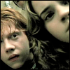
Post by punkrawkerspike on Jul 23, 2005 10:57:11 GMT -5
What can I say?? THIS IS A 10!! Chad Michael Murray is hottttttttttttt..... 'nuff said. Never change it Matty. Oh don't worry. Once I found all of these pics together, I KNEW they had to be used for a banner. I'd seen a couple before, but not all of them in the same place like that. Seeing it, that's when the light bulb came on and I got the idea. Anyway, this is now my favorite banner EVER so it won't be going anywhere. Naki, your banner gets a 10! I'm feeling generous today. Your banner just makes me feel so nice for whatever reason...the scene of Buffy and Dawn bonding combined with the bright, sunny yellow...it gives me a strange urge to go watch a Hilary Duff movie. In fact, I think I'll go do that anyway! xD |
|
|
|
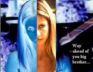
Post by Sammie on Jul 23, 2005 11:53:32 GMT -5
*drool* *drool*
Erm.. what was this topic about?
O... yes, well..... i love the 'blending' and the 'text' is good too.... yes, a 9 i'd say
*licks screen*
|
|
|
|
Post by punkrawkerspike on Jul 23, 2005 12:01:54 GMT -5
*drool* *drool* Erm.. what was this topic about? O... yes, well..... i love the 'blending' and the 'text' is good too.... yes, a 9 i'd say *licks screen* Don't worry, I'm the saaaaame way. I don't think my screen will ever recover from the molestation! And I don't know why, I just love my new banner -so- much that I can't shut up about it! Sammie, your banner gets a 10! It's such a nice theme and it makes me happy. Way to go! ^_^ |
|
|
|
Post by AngelAficionado on Jul 23, 2005 12:12:14 GMT -5
Matt's.....ban-banner...gets a ten......from me...*passes out*
|
|
|
|
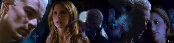
Post by The Second Evil on Jul 23, 2005 12:21:20 GMT -5
Whoa. AngelAficionado's banner is simply stunning. The pictures blend together so well and the effects used are amazing. I love the pictures along the bottom, and all the pics used are nice and clear. I really love it. It's a 10/10, easily.
|
|
|
|
Post by Lior Knight on Jul 23, 2005 12:30:12 GMT -5
Thanks for the kind words, guys. It’s much appreciated.  Anyway, I give The Second Evil’s banner 10. Lilah rocks! ;D |
|
|
|
Post by immortalvamp on Jul 23, 2005 12:33:49 GMT -5
Loirs banner gets a 10, i like all your banners they are so creative and i like the patterns that surrounds them. Keep up the good work
|
|
|
|
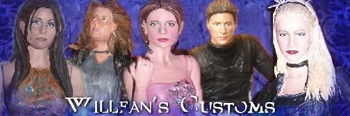
Post by Willfan on Jul 23, 2005 14:30:40 GMT -5
I absoultely love Naki's banner/icon stuff. I just watched that episode, and it's great to see something with a different, light tone but still include Buffy. The design and colors work perfectly, and I love the goldfish quote. 10!
|
|
|
|
Post by Justhad on Jul 23, 2005 15:09:46 GMT -5
Keeping with the theme - Marco I LOVE your banner - it really showcases some of your best work and the colors are beautiful!
|
|
|
|
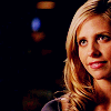
Post by hitnrun017 on Jul 24, 2005 0:00:20 GMT -5
I love the picture of Sarah Michelle Gellar. It works great with the white backround. And I like the text for your name. I give it an 8.5/10.
|
|
|
|
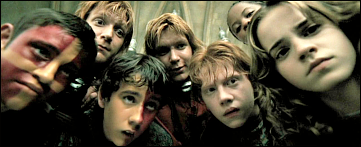
Post by immortalvamp on Jul 24, 2005 5:13:15 GMT -5
im giving this banner a 7. Firstly i think its based on a good episode however i do think you could try blending them together rather than just putting black boarders round the pictures and also it is very dark too,
|
|
|
|
Post by The Second Evil on Jul 24, 2005 9:44:24 GMT -5
I LOVE Naki's banner. Easily a 10/10. The pictures used are great and brilliant quality. It's also great to look at a banner with a bit of colour in it! The pictures blend and flow very well together aswell, making the banner look very proffessional - Overall, one of my favourite banners on the forum at the moment!
|
|
|
|
Post by punkrawkerspike on Jul 24, 2005 9:52:23 GMT -5
SE's banner gets an 8. I love the little Lilah collage going on there, and love the quote. Great job!
|
|
|
|
Post by Digital Leonardo on Jul 24, 2005 17:52:38 GMT -5
8 - You managed to get a naked CMM with out it being R rated. Good job!
|
|
|
|
Post by hitnrun017 on Jul 24, 2005 17:58:00 GMT -5
I give yours a 11/10. I love that episode and Harmony. The pink works good for Harmony!
|
|
|
|
Post by AngelAficionado on Jul 24, 2005 17:58:40 GMT -5
I'm giving Digilee's banner a 10, the pictures are blended really well, the colours are gorgeous and really lush, the scene is just...hilarious and the caption just fits SO well, and makes me chuckle, so yeah, a sure 10. Great work!
|
|
|
|
Post by punkrawkerspike on Jul 24, 2005 18:03:40 GMT -5
Gee, since James is all stubborn, I'll just rate you both!
hitnrun, I'll give you a 5/10. There's not really too much going on there, creatively...a couple of the pics seem kinda distorted, also...but, at the same time, I've seen more hideous banners than that, so...way to go! xD Plus, it's better than a 4, right?
James, your banner gets a 10/10! It's amazing, what more can I say? Love the effects...love the picture choices...love the way things all seem to belong together. Perfect!
Oh, and Digilee, trust me...the lack of R-ratedness isn't by choice! This was just the nakedest I could find him.
|
|
|
|
Post by hitnrun017 on Jul 24, 2005 18:06:43 GMT -5
Haha thanks. But there isn't much you can do when you have to use paint. I will give yours a 7/10
Edit- I soo ment 10/10
|
|
|
|
Post by Digital Leonardo on Jul 24, 2005 18:22:59 GMT -5
7/10 - Kind of wonky but hey, it's Chiaki!
|
|