|
|
Post by Thorn Of Deucalion on Jul 21, 2005 2:39:27 GMT -5
buffyfanone , you have a cool banner i give it an 8 , the Colour works well as do the pics , a ( bit blurry tho ) still a Great banner , i like how it tells a story , ( well i think so )
|
|
|
|
Post by Digital Leonardo on Jul 21, 2005 2:45:23 GMT -5
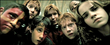
8 - I really like the Fear Itself peice. I like how you got almost everyone in there. I think the demon is taking up to much room, and Oz should of been in there ^^;. But I like the text, it fits the peice really nicely.
|
|
|
|
Post by Thorn Of Deucalion on Jul 21, 2005 2:51:38 GMT -5
9- i love you banner to dead ! the two pic look so good , in there fighting pose , I think pink was a good Colour ! I love the size of it to !
|
|
|
|
Post by SlayerLV on Jul 21, 2005 3:17:58 GMT -5
I give Gachnar's banner a 9 because I love the episode and the pictures blend well together. I would have given it a 10 if Oz was on it too.
|
|
|
|
Post by Cordy on Jul 21, 2005 5:10:59 GMT -5
I give SlayerLV's banner a 10 . The pictures are blended together well and they are a great choice and postitioned well . I like the grid type thingy on it . It looks great . The only thing is that two of the pictures are blurred but its a brilliant banner anyway and it has an icon to match  |
|
|
|
Post by bloodyhell on Jul 21, 2005 10:50:25 GMT -5
Cordy's Banner I give a 7.5, I like the pics used they look good together, I like the size of the banner and it is blended well, but the gap between the pics were it says cordy bothers me a bit, overall it is a cool lil banner.
|
|
|
|
Post by immortalvamp on Jul 21, 2005 11:10:24 GMT -5
Im giving this banner a 8.5 because the quality is great and the blending between pictures is also good, the only real problem i see is that it is a little on the large side but other than that great banner! |
|
|
|
Post by BuffyFanOne on Jul 22, 2005 1:21:04 GMT -5
Naki, I love your banner! I am giving it a 9! The pictures work very well together and the color was a nice choice! The pattern in the background helps the flow of it all by bringing it all together with a sense of unity! Nice work! A note on my banner...I did not make it, I do not know who did. My cousin sent me the larger image she found on yahoo and saved to disk. I cropped it and added the words. |
|
|
|
Post by Digital Leonardo on Jul 22, 2005 4:57:40 GMT -5
|
|
|
|
Post by Cordy on Jul 22, 2005 8:14:44 GMT -5
I give Digital Leonardo's banner a 10 . I love the vibrant pink . Its lovely . The pics are put together brillaintly and I love the fading around the edges of them . I love the lil quote , uits finishes it off perfectly . Well Done on a great banner  |
|
|
|
Post by stakey on Jul 22, 2005 10:59:51 GMT -5
I give Cordy's banner an 8. Its one of my favourite episodes and I think the banner is nice and simple, but in a good way. It shows Dawn and Buffy as they look at each other for the last time before she jumps which is really nice and the picture in the middle is cool. The reason it lost out on some marks is because the three images dont really blend into each other and the middle is slightly (very slightly) fuzzy compared to the other two images. Overall, an 8. |
|
|
|
Post by SlayerLV on Jul 22, 2005 13:28:39 GMT -5
I give staketotheheart's banner a 8.5 I love the big bad theme and i think it blends well together.
|
|
|
|
Post by Sammie on Jul 22, 2005 14:10:01 GMT -5
I love this banner, it's a great idea, pictures of Buffy from the first episode of every season. They blend really good (YAY Lior ) and i love the colour theme (blue) Too bad it's a bit grainy (sp?) EDIT: Oops, i forgot  : I'll give this one a 8.9  |
|
|
|
Post by prophecygirl on Jul 22, 2005 14:13:52 GMT -5
i give sammie's 9/10 'cause the images blend well and are very clear |
|
|
|
Post by immortalvamp on Jul 22, 2005 17:39:40 GMT -5
Im giving this banner a 9 - firstly the pictures are very very well blended to make a complete picture rather than many small ones. and also i just love the quote tats on the banner. Great banner! |
|
|
|
Post by ba|1 on Jul 22, 2005 17:42:01 GMT -5
10 points for naki. I really like the banner you made. The colors and pictures you used look amazing ! Great work
|
|
|
|
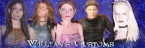
Post by Willfan on Jul 22, 2005 17:47:34 GMT -5
I give that banner a 9.999999!
I love how the background is the same, but the pics are different...and there's a really nice rythm with the repition. Finally something worthy of the first! Also love the look of the avatar...simple but matches well and SMG is just gorgeous enough on her own hehe.
|
|
|
|
Post by Little Willow on Jul 23, 2005 0:23:33 GMT -5
i'm deffenetly diggin the banner Willfan i love that Sunday...Lior Knight is a god isn't he?!? i give your banner a 8.7
|
|
|
|
Post by punkrawkerspike on Jul 23, 2005 9:30:05 GMT -5
Little Willow's banner gets a 10! I know earlier I said nothing could be perfect, but I really don't see anything wrong with this banner. Love the pics of the Buffy busts, love the colors, love the effects. But of course, it was done by Lior Knight, so it's bound to be awesome!
|
|
|
|
Post by Justhad on Jul 23, 2005 10:46:00 GMT -5
What can I say?? THIS IS A 10!! Chad Michael Murray is hottttttttttttt..... 'nuff said. Never change it Matty.
|
|


 :
: